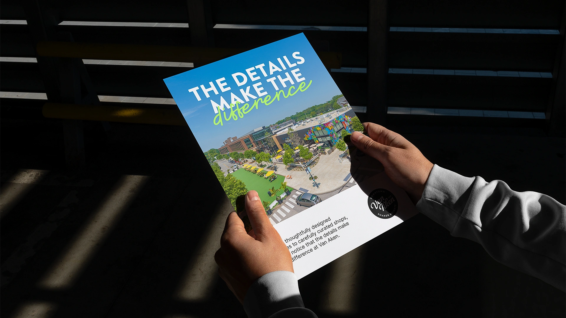
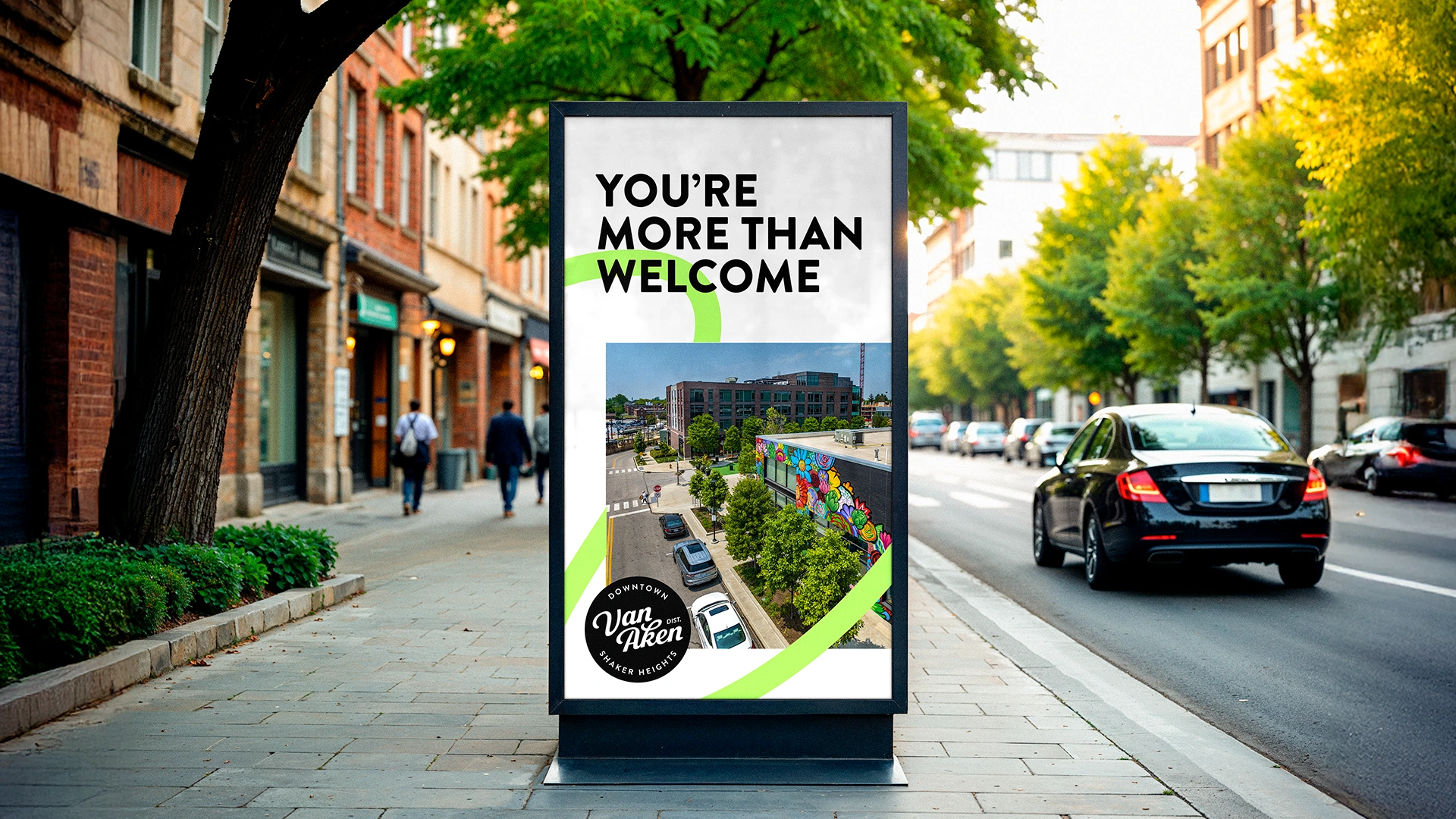
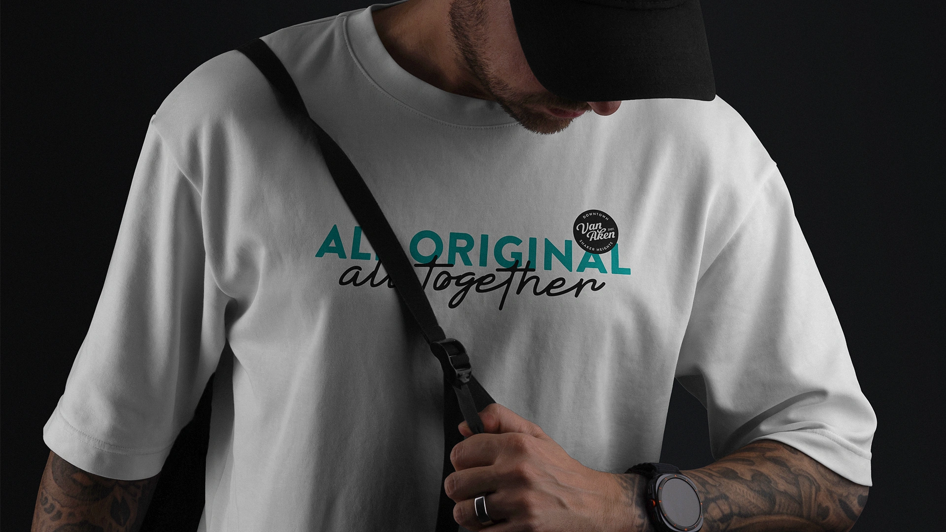
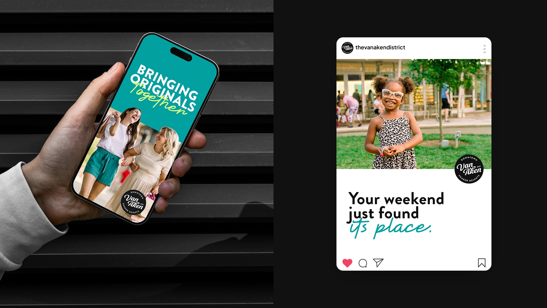
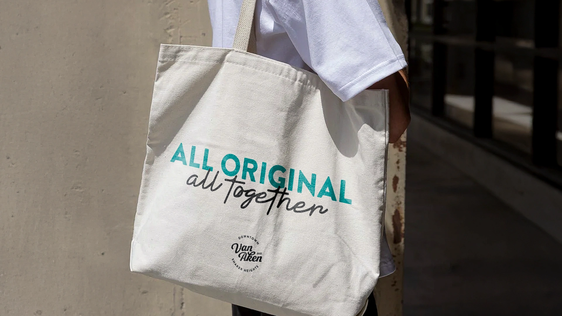
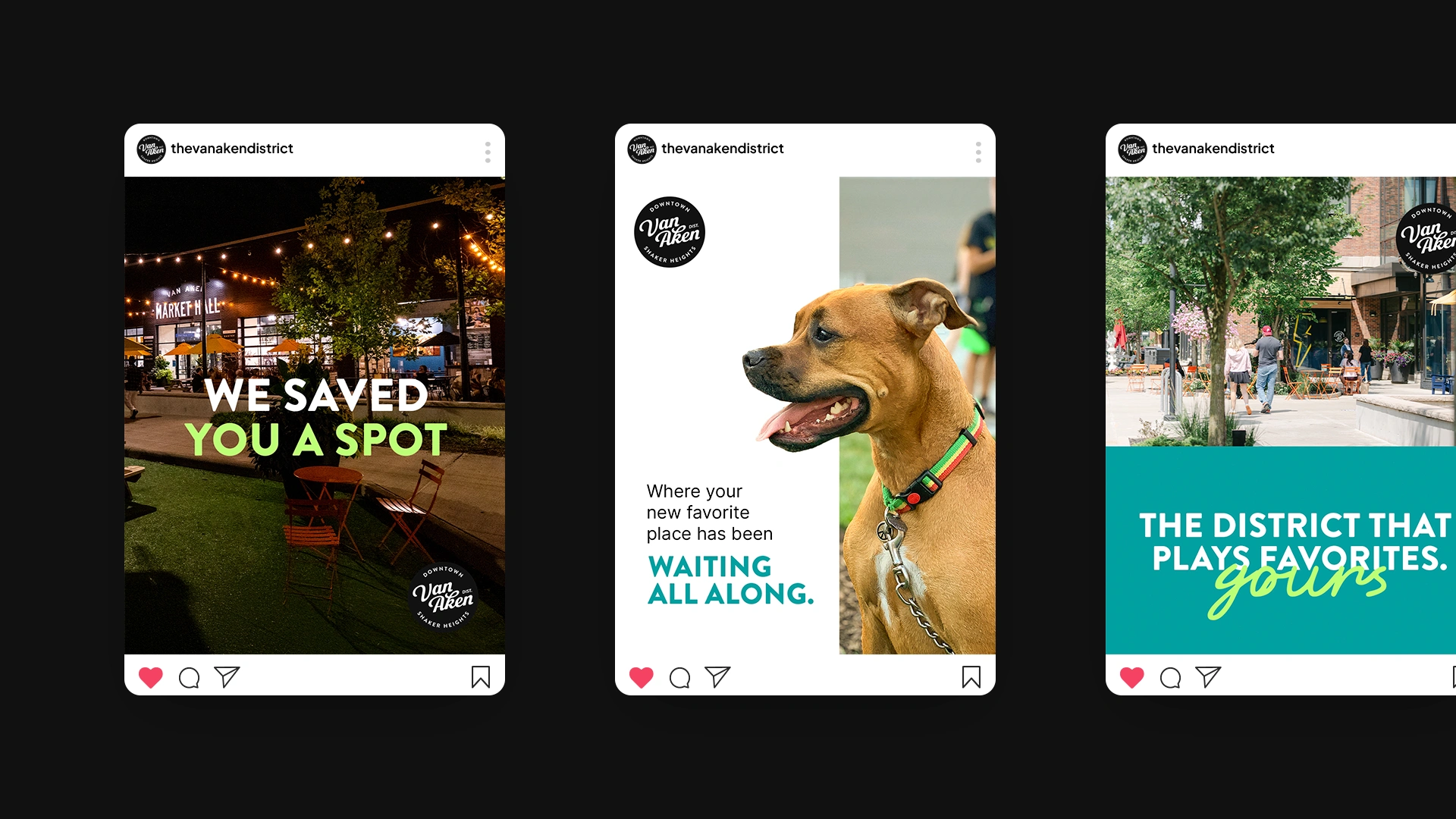
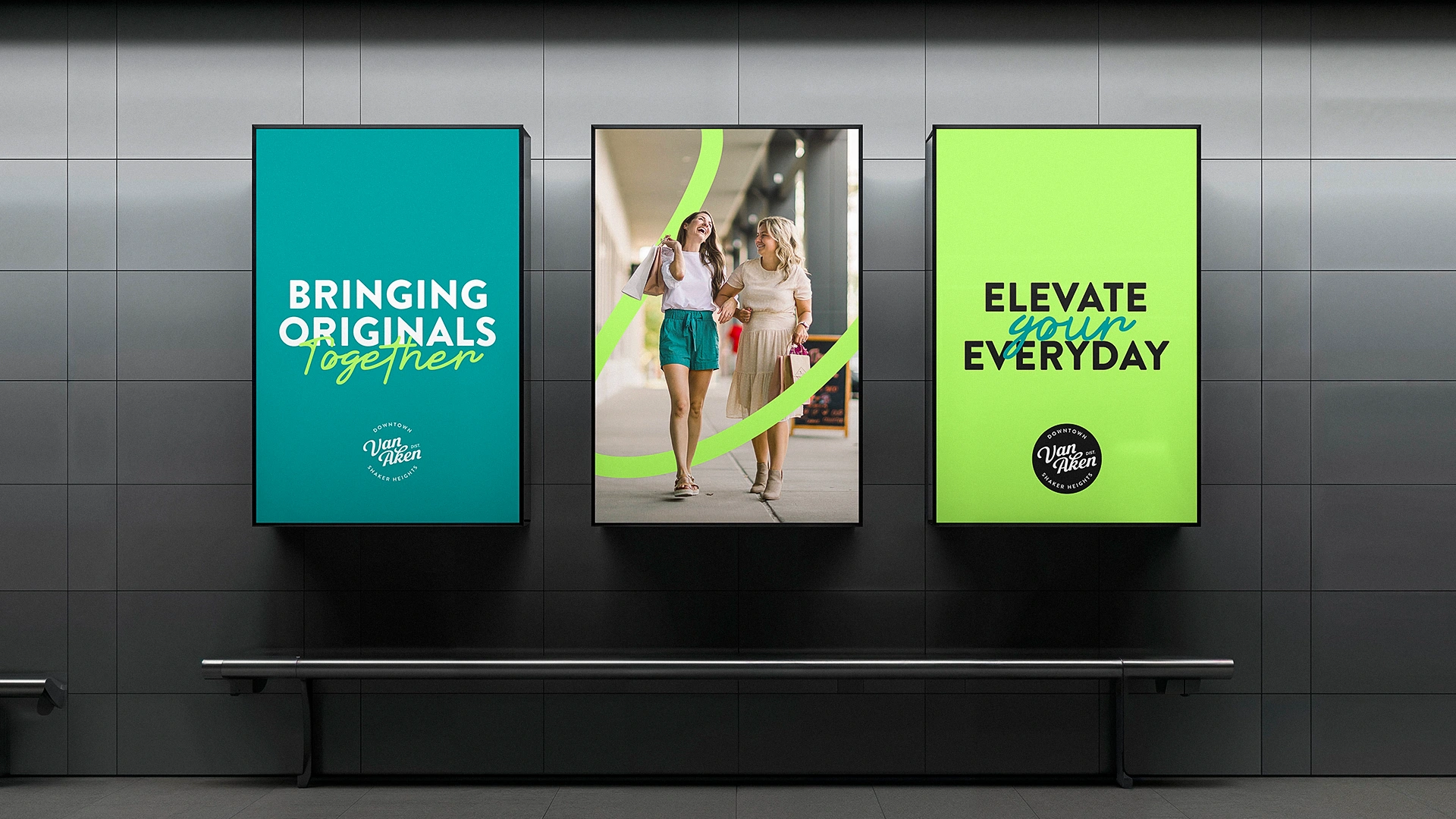
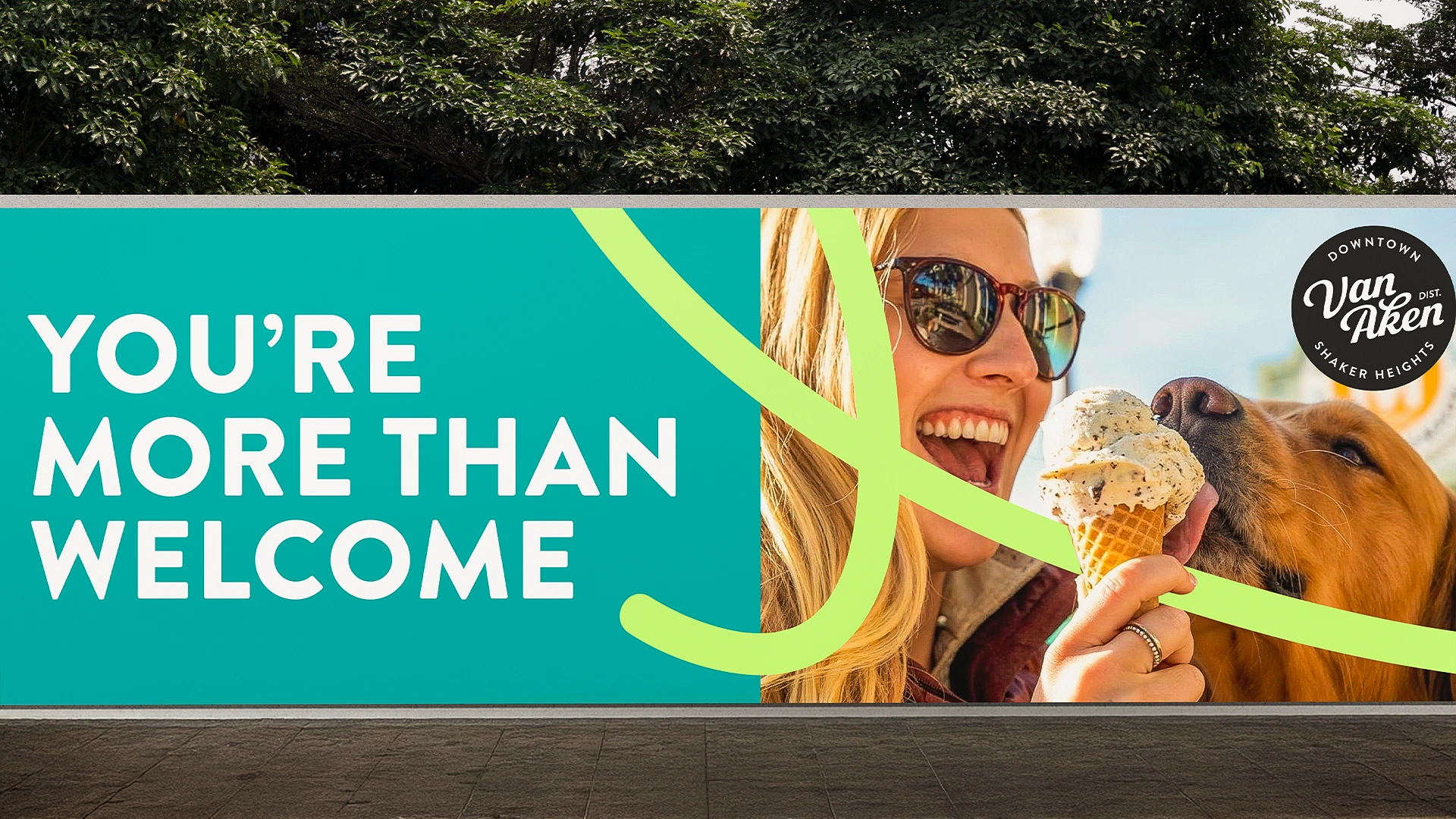
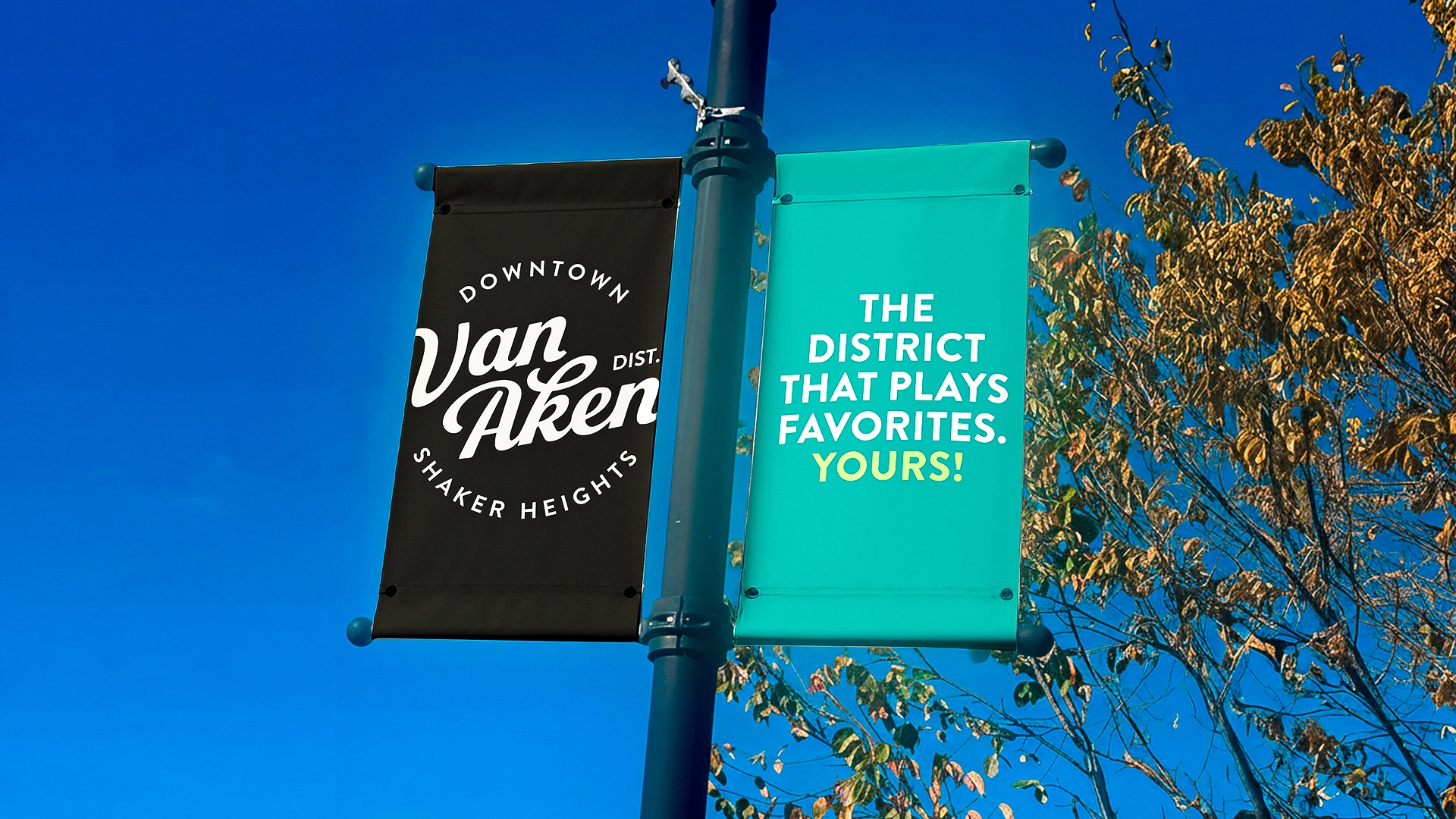
We partnered with Van Aken to evolve an already well-loved brand for the future. With a strong foundation in place, the focus was on modernizing the identity, refreshing the color palette, and refining typography to work seamlessly across digital, print, and environmental applications. We honored what people recognized while building a system designed to flex and grow.
The result: a revitalized brand identity that feels current, cohesive, and ready to show up consistently wherever Van Aken does.

Heading 1
Heading 2
Heading 3
Heading 4
Heading 5
Heading 6
Lorem ipsum dolor sit amet, consectetur adipiscing elit, sed do eiusmod tempor incididunt ut labore et dolore magna aliqua. Ut enim ad minim veniam, quis nostrud exercitation ullamco laboris nisi ut aliquip ex ea commodo consequat. Duis aute irure dolor in reprehenderit in voluptate velit esse cillum dolore eu fugiat nulla pariatur.
Block quote
Ordered list
- Item 1
- Item 2
- Item 3
Unordered list
- Item A
- Item B
- Item C
Bold text
Emphasis
Superscript
Subscript

.webp)